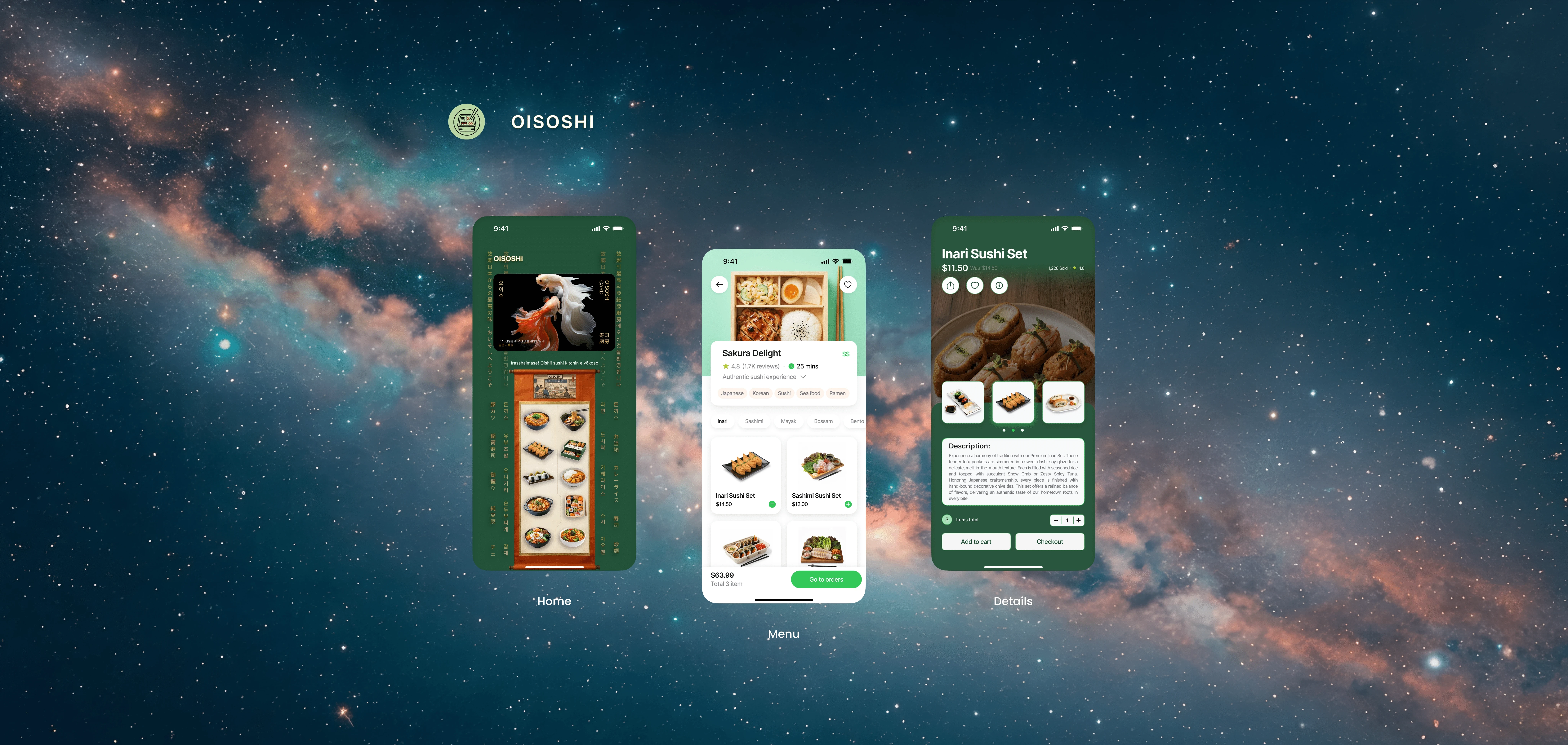
Oisoshi: Elevating Culinary Delivery
Adaptive Order Flows • Intuitive Navigation • Regional Culinary UX

Context
Designed a specialized digital platform tailored specifically for high-end culinary curation, seamless restaurant selection, and refined dining exploration.
Role
Product Designer
Timeline
4 Weeks
Core features
Cultural-Centric Navigation: Architected a high-fidelity interface to ensure users can effortlessly explore multi-regional Asian cuisines regardless of their technical familiarity.
Integrated Order Accuracy: Implemented a unified system to maintain consistent quality and pricing across all branches, eliminating fragmentation found in legacy apps.
Performance Optimization: Optimized for low-latency, mobile-first performance, ensuring a frictionless ordering journey under varying network conditions.
Statistics and Secondary Research
The research process combined quantitative product metrics with qualitative insights from user and stakeholder interviews. This analysis surfaced a clear market disconnect: a high consumer appetite for authentic Asian dining hampered by disjointed, low-trust digital ordering journeys.
17%
Optimized Order Growth
11%
Increase in Repeat Orders
42s
Checkout Time Reduction
Findings from Primary Research
Synthesizing secondary research with targeted usability studies and remote user sessions across a diverse cohort of food enthusiasts—ranging from casual diners to busy professionals—to identify the specific barriers preventing smooth online food ordering.
Light Mode
Optimized interfaces for all-day usage; designed to reduce cognitive load while browsing menus.
Seamless Ordering
Integrated high-visibility navigation with instant access to menu items and cart details.
Quick Response
Adopted a mobile-first architectural approach to guarantee performance across all device breakpoints.
The Redesign
After a thorough analysis of current ordering patterns, the design direction was established to bridge the gap between fragmented delivery service experiences and the high expectations of the Asian culinary community.


Design validation
To measure the impact of the redesign, the interface was validated through rigorous testing with a diverse user cohort. The following methodologies were utilized to ensure performance objectives were met.
Benchmarking
Evaluated ordering flows against industry leaders to pinpoint friction points and optimize conversion.
Contextual Inquiry
Conducted to identify patterns of user interaction and optimize engagement zones.
Usability Testing
Validated the interface's intuitiveness for a faster, more seamless ordering flow.


"The transition is seamless—ordering my favorite meals feels much more natural and personal now."
-Culinary Enthusiast
Impact Created
Based on usability testing and heuristic evaluation, the following metrics were projected to represent the platform's potential performance improvements post-launch.
34%
Order Accuracy & Consistency
38%
Search & Discovery Speed
23%
User Return & Reorder Rate
Project Artifacts
The following artifacts provide insight into the strategic design process, framework, and iterative problem-solving applied throughout the Oisoshi case study.
Strategy & Insights
The Oisoshi project served as a rigorous exercise in translating complex culinary and logistical goals into a functional, premium digital experience. Key insights focused on the importance of inclusive UI design and the challenge of balancing high-end aesthetic presentation with accessible, frictionless navigation.


Design System Foundation
Developed a unified UI library to maintain visual harmony and simplify scaling features across the Oisoshi experience.
Rapid Iteration
Maintained high design velocity through rapid, user-centric iterations, ensuring updates improved accessibility and usability.
Research-Driven Validation
Applied usability testing to refine the Oisoshi ordering flow, successfully guiding users from discovery to conversion.